At VRS'92, we provide comprehensive rebranding solutions to revitalise your branket position, enhance competitiveness and stimulate sales growth. Our approach to rebranding is aimed at enabling your brand to maintain relevance, and connect d’s marmore effectively with your target market, ultimately contributing to your brand’s commercial viability and sustainability. Whether your brand requires a revamped strategy tailored to the current market situation, a complete brand transformation or minor adjustments to brand identity and packaging, our services cover the full spectrum of business needs.
Our solutions:
- rebranding strategy roadmaps
- rebranding strategy workshops
- brand repositioning
- visual brand identity design
- packaging design
- verbal brand identity creation
- owned media (website, social, etc.) design and development
- brand style guide creation
- print and digital marketing material creation
#1
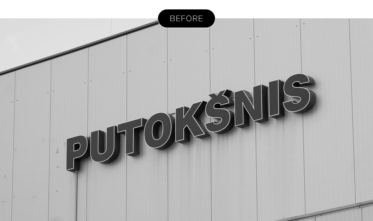
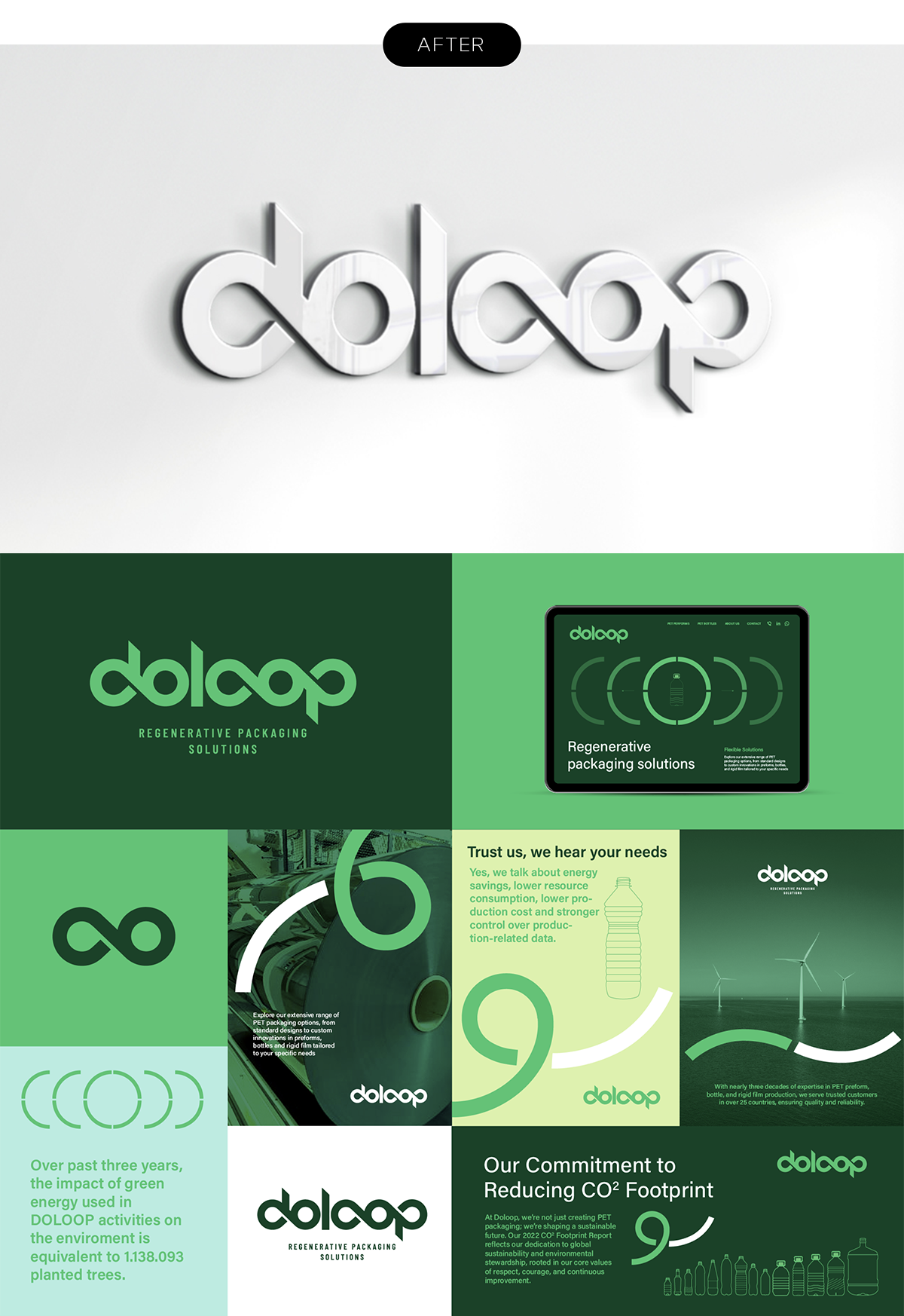
“Putokšnis” rebranding
SITUATION
As one of the leading PET manufacturers in Lithuania, UAB Putokšnis focuses on both local and international partners. To become a globally relevant brand while consistently striving for zero emissions and adhering to circular economy principles, the company recognized the need for changes in its business strategy, positioning, and branding.
SOLUTION
Having defined differentiating values in our business strategy, we embodied them in the new brand name, DOLOOP, and across all visual brand identity touchpoints. The circularity of operations, a fundamental aspect of company’s business philosophy, is visually expressed throughout the entire brand identity system. The infinity symbol serves as a connecting semantic element in both the logo and the overall visual identity.
DELIVERABLES
BUSINESS IDENTITY STRATEGY
BRAND STRATEGY
NAME
LOGO
BRAND BOOK
#2
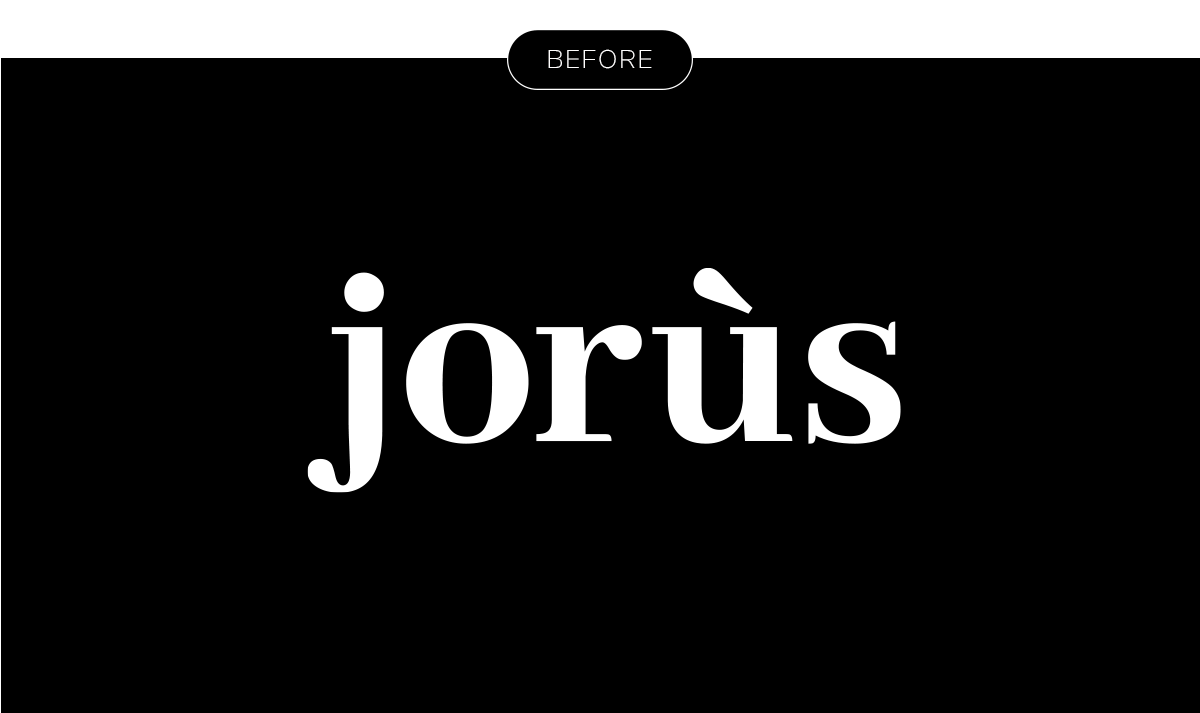
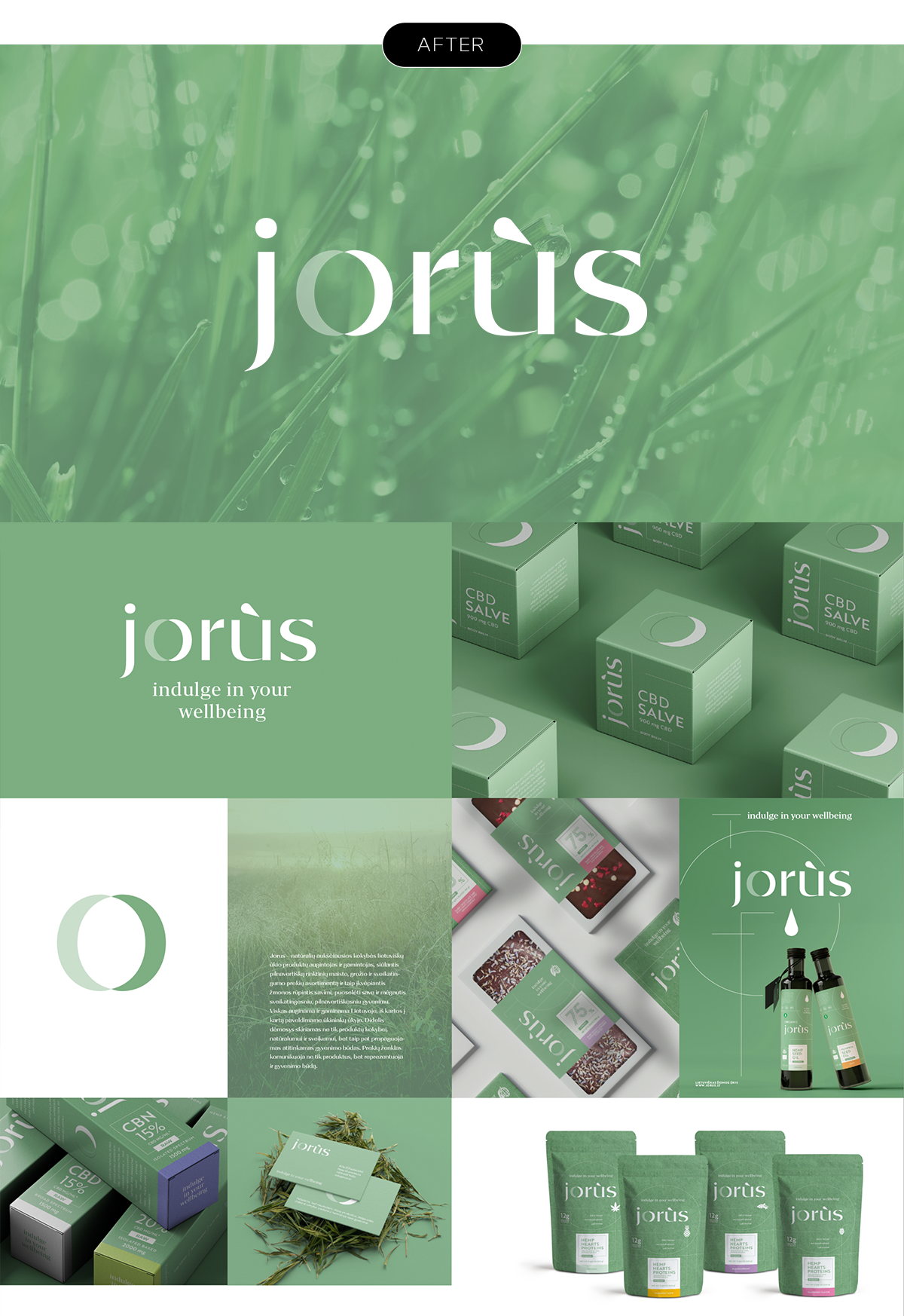
“Jorus” rebranding
SITUATION
A small Lithuanian farm, JORÙS, produces food, beauty, and wellness products. These essential elements enable JORÙS to continuously create the highest quality products focused on health and naturalness. As the product range expanded and sales channels increased, there was a growing need to communicate not only specific products and their benefits but also to represent a healthier lifestyle and inspire consumers to take care of themselves.
SOLUTION
In the renewed JORÙS brand identity, we visually conveyed the ideas, structure, and organometry of living nature. The logo, constructed from plant-inspired elements, maintains a modern aesthetic. The letter "O" symbolizes a closed, ever-repeating organic cycle. These concepts were applied across all visual identity touchpoints and packaging designs.
DELIVERABLES
BRAND STRATEGY
LOGO
BRAND BOOK
PACKAGING
#3
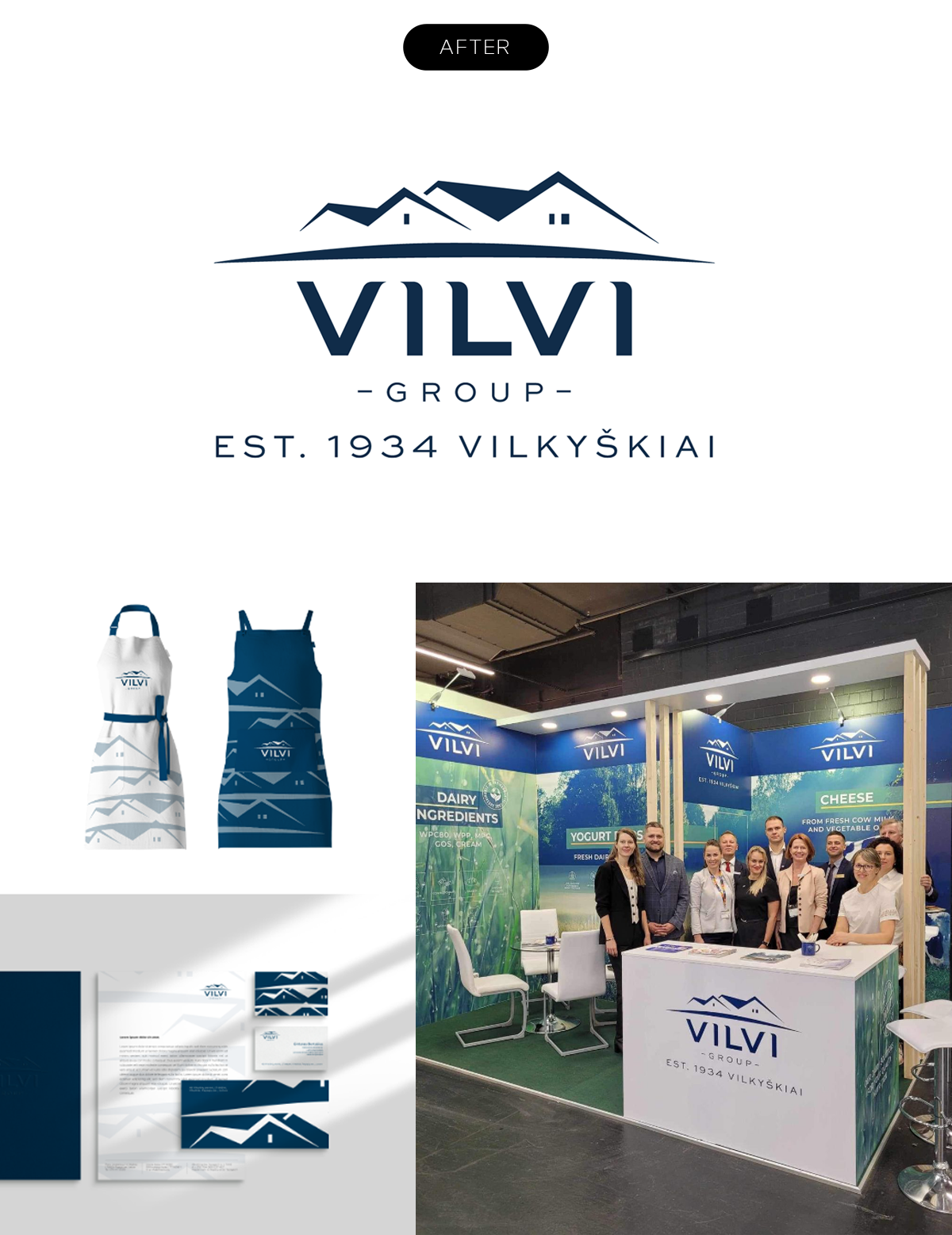
“VILVI” rebranding
SITUATION
The well-known and consumer-favorite dairy producer VILKYŠKIŲ PIENINĖ has evolved into a global brand, with its products recognized in many international markets under the name VILVI. As the company expanded, both in number of subsidiary companies and in its focus on technology and innovation, the VILVI GROUP of companies was established. This growth necessitated a refreshed identity for the entire group.
SOLUTION
In creating the modern, technology- and innovation-oriented identity for VILVI GROUP, the aim was to preserve their accumulated experience and visual recognizability while communicating a new business promise: our dairy contribution to a quality life.
DELIVERABLES
-
-
-
BUSINESS IDENTITY STRATEGY
-
BRAND STRATEGY
-
LOGO
-
BRAND BOOK
-
PACKAGING
-
WEB
-
-
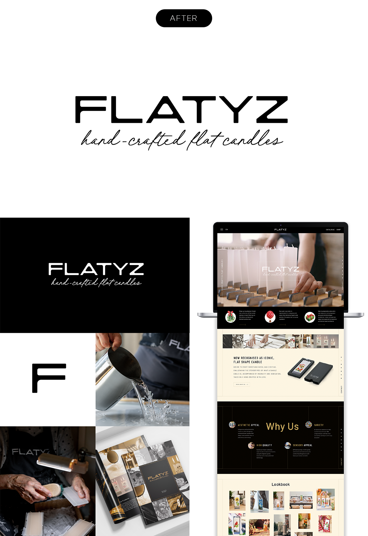
SOLUTION
While maintaining the brand identity's recognizability, we developed a new identity rooted in the essence of our brand strategy: aesthetics and craftsmanship. The logo's font remains angular but is visually softened, as if gently melted by the warmth of a candle. This artistic, luxurious brand identity encapsulates the essence of our values.
DELIVERABLES
BRAND STRATEGY
LOGO
BRAND BOOK
WEB

