UŽDUOTIS
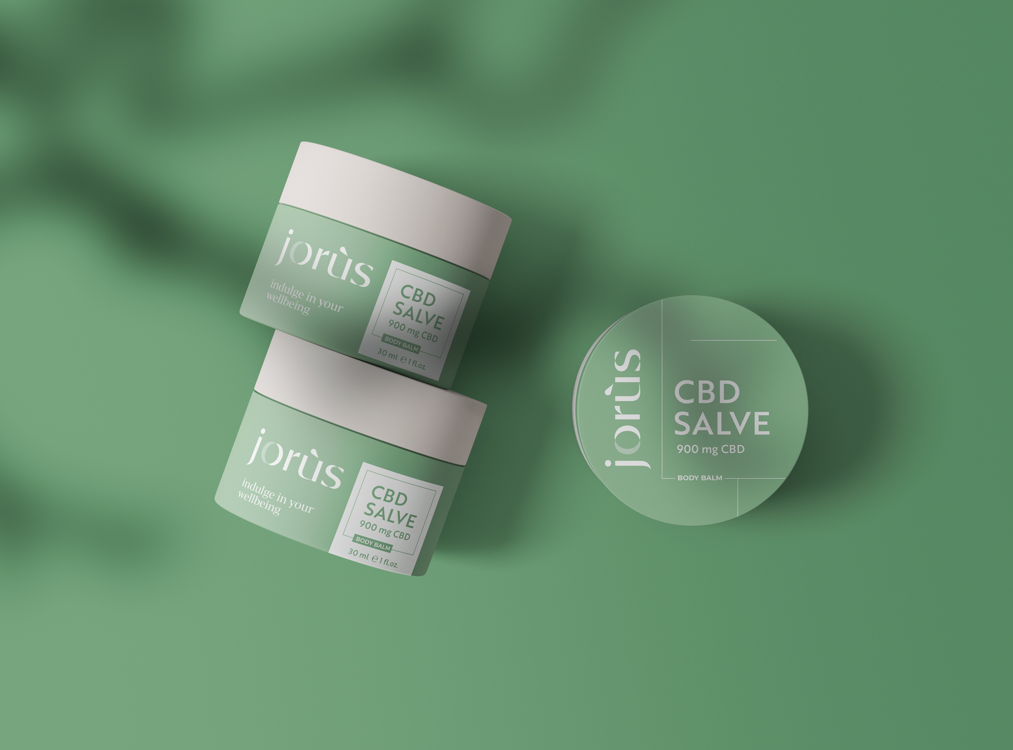
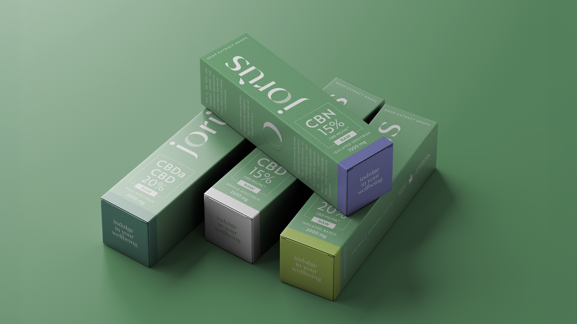
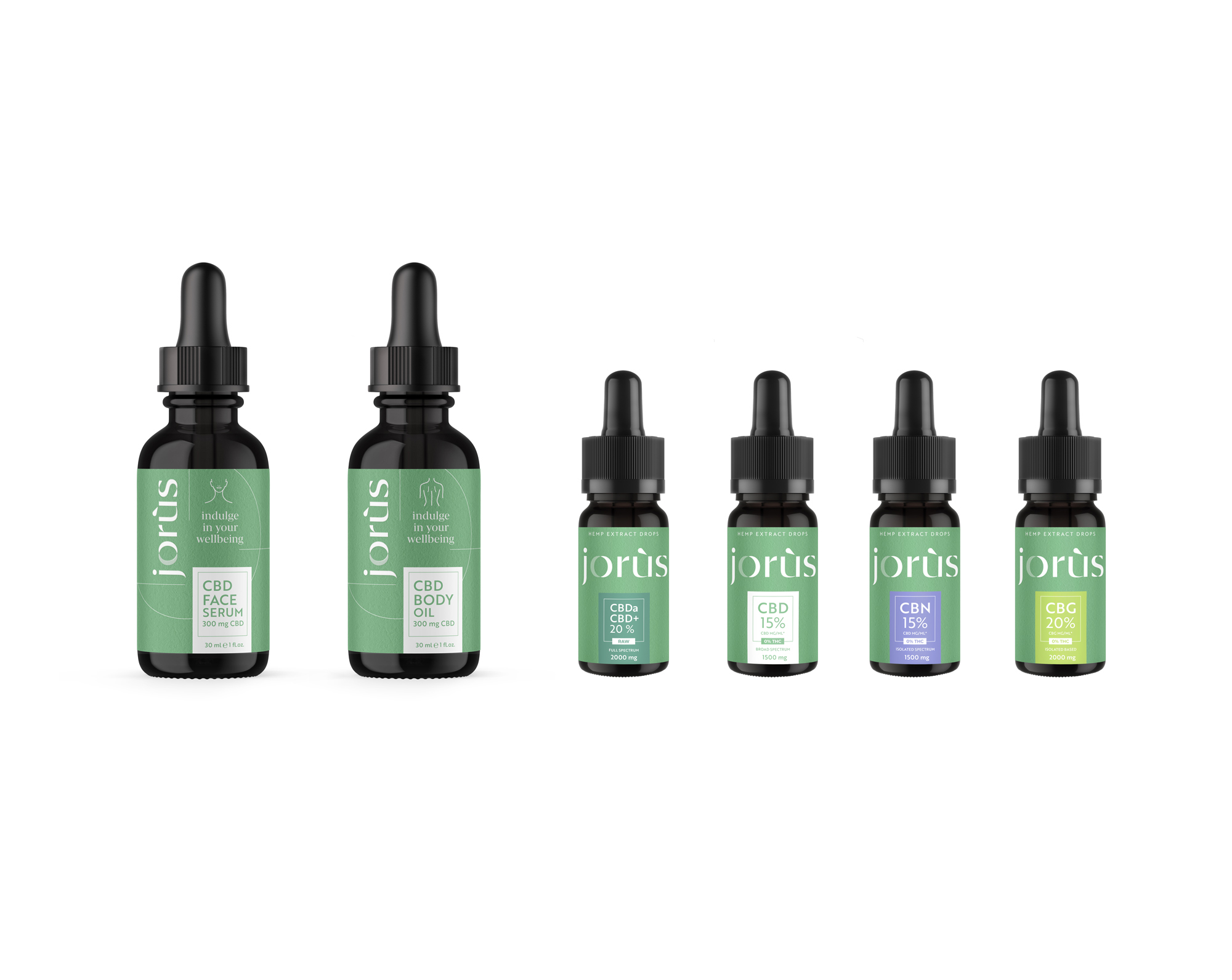
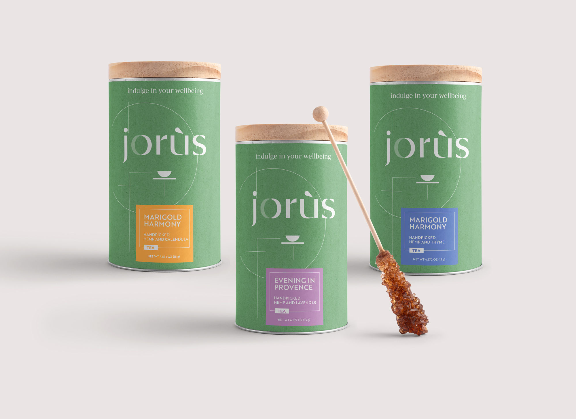
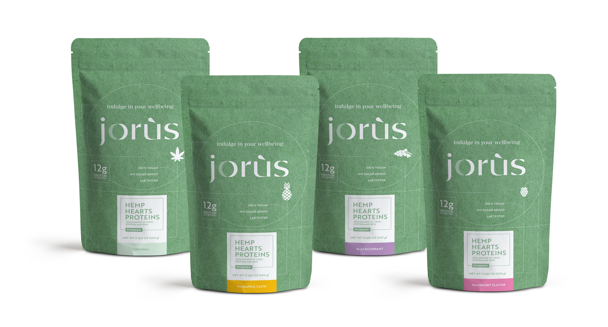
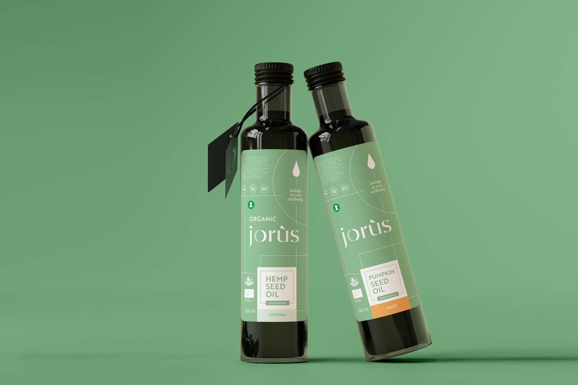
Mažas Lietuvos ūkis JORÙS gamina maisto, grožio ir sveikatinimo produktus. Šie esminiai elementai leidžia JORÙS nuolat kurti aukščiausios kokybės gaminius, orientuotus į sveikatą ir natūralumą. Plečiantis produktų asortimentui ir augant pardavimo kanalams, atsirado vis didesnis poreikis komunikuoti ne tik apie konkrečius produktus ir jų naudą, bet ir perteikti sveikesnio gyvenimo būdo idėją bei įkvėpti vartotojus rūpintis savimi.
SPRENDIMAS
Atnaujintoje JORÙS prekės ženklo tapatybėje vizualiai perteikėme gyvosios gamtos idėjas, struktūrą ir organometriją. Logotipas, sudarytas iš augalų motyvais įkvėptų elementų, išlaiko šiuolaikišką estetiką. Raidė „O“ simbolizuoja uždarą, nuolat besikartojantį organinį ciklą. Šios idėjos pritaikytos visose vizualinės tapatybės ir pakuočių dizaino išraiškose.